01 — Color & Warmth
Terracotta, olive green, warm cream. Colors drawn from Mediterranean landscapes. Used generously but never overwhelming.
Mediterranean Fine Dining
Aster & Salt is a Mediterranean fine dining restaurant celebrating seasonal ingredients, olive oil, and the convivial culture of shared meals. The brand evokes sun-drenched coastal villages and family gatherings around long tables.
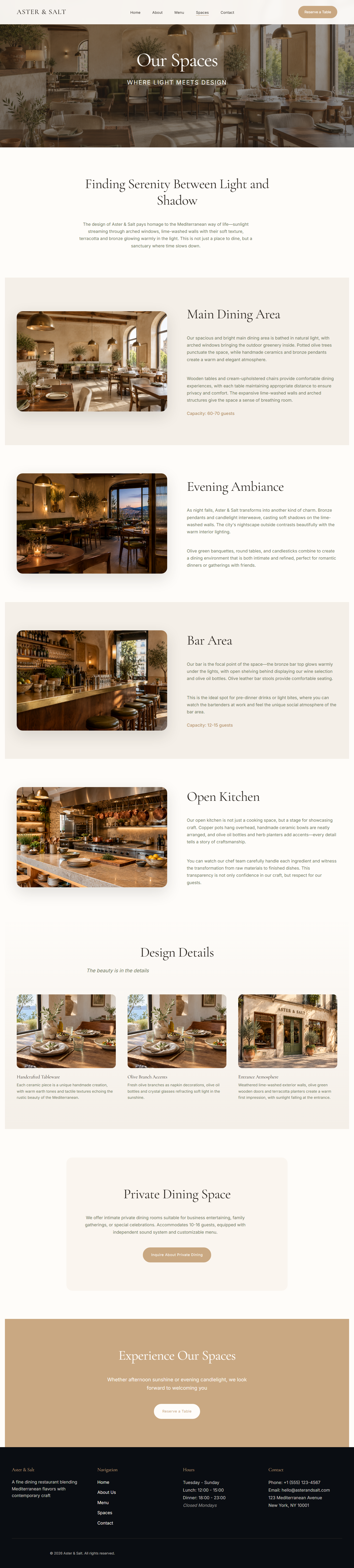
The website needed to feel editorial—like flipping through a food magazine—while remaining practical for reservations, menu browsing, and event inquiries. We used warm earth tones, generous imagery, and flowing typography to create an inviting yet refined experience.
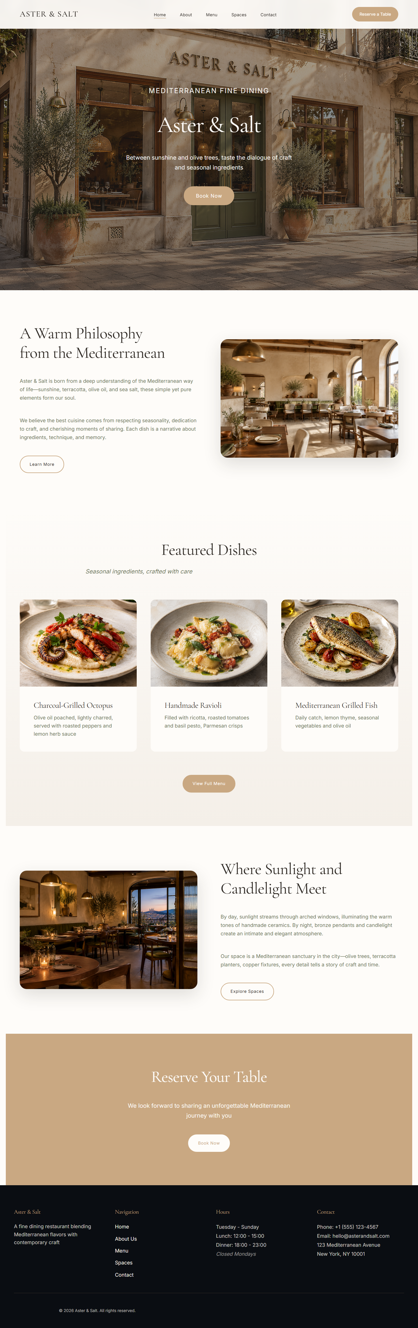

Terracotta, olive green, warm cream. Colors drawn from Mediterranean landscapes. Used generously but never overwhelming.
Large, hero-sized imagery. Natural light, warm tones, overhead shots. Every photo tells a story about ingredients or place.
Multi-page structure with clear navigation. Each page feels like a chapter. Generous white space between sections creates breathing room.
Serif headings for elegance, sans-serif body text for readability. Large, confident type hierarchy guides the eye naturally.
A multi-page structure can hold a richer restaurant story without making the practical path harder to follow. The menu, atmosphere, spaces, and reservation journey each get room to breathe while staying connected.
Let's discuss how to bring your restaurant's story, menu, and atmosphere online.