01 — Dark Foundation
Deep charcoal backgrounds with ember-orange accents. White text for high contrast. The palette evokes wood smoke and glowing coals.
American Steakhouse
Forge & Ember is an upscale American steakhouse celebrating dry-aged beef, open-fire cooking, and bold flavors. The brand identity centers on craftsmanship, quality, and unapologetic indulgence.
The website needed to match that confidence: dramatic, dark, masculine without being aggressive. We used rich blacks, ember-orange accents, and large-scale photography of flames, meat, and well-worn leather to create an atmosphere of refined power.
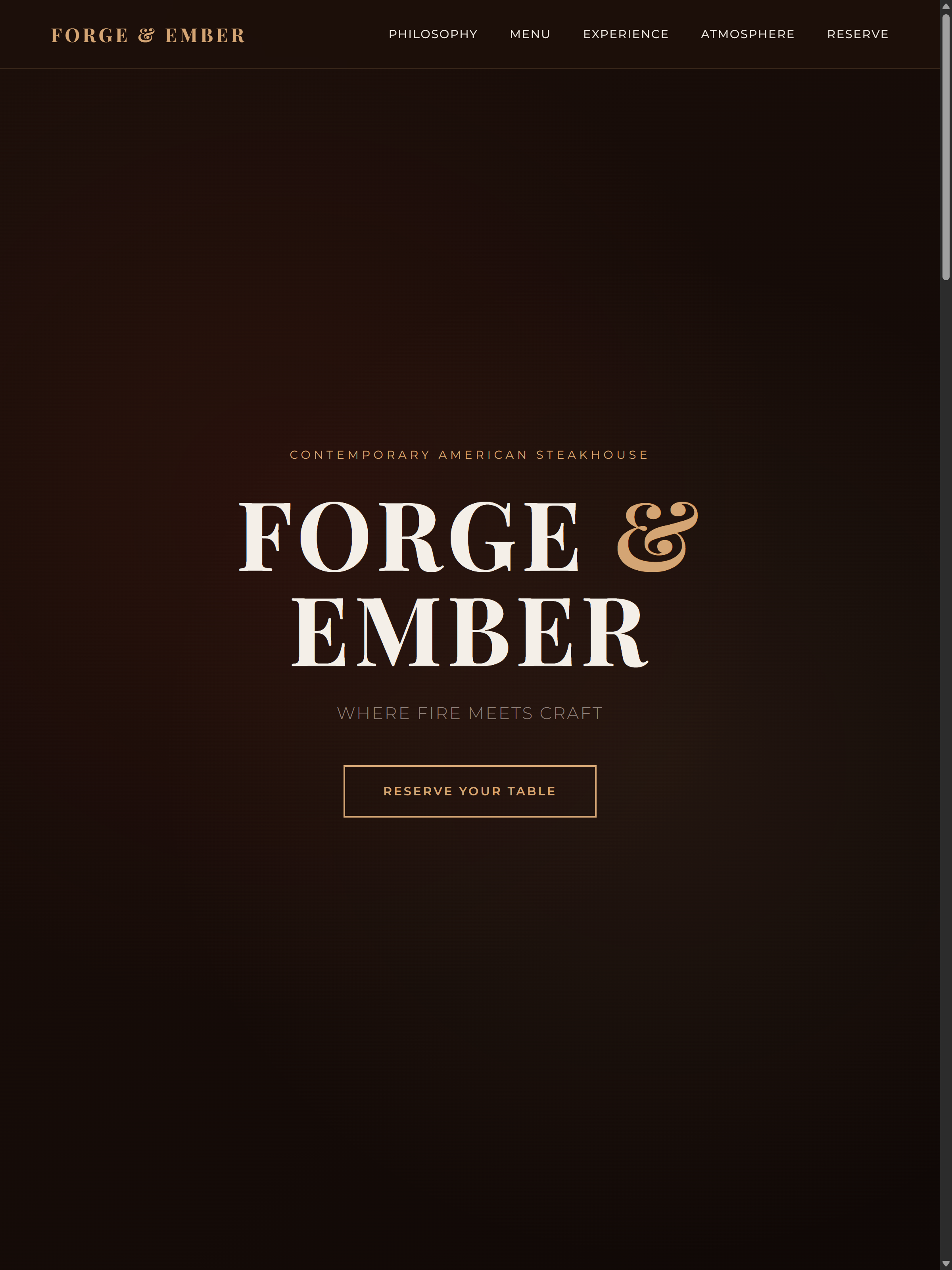
Bold hero design with dramatic fire and craft imagery
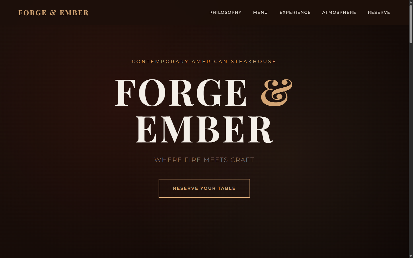
Dark luxury navigation and hero section
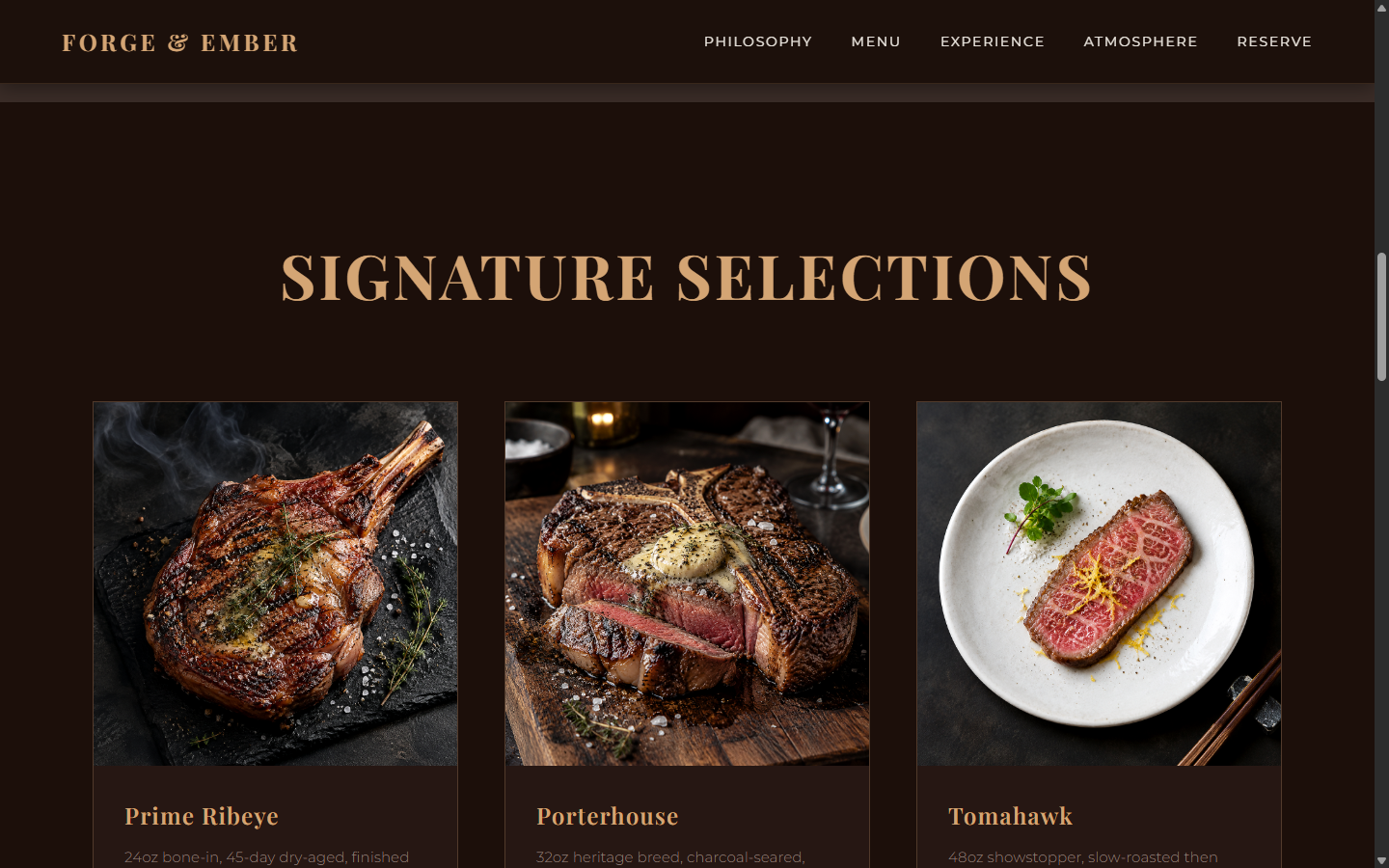
Menu presentation with food photography grid
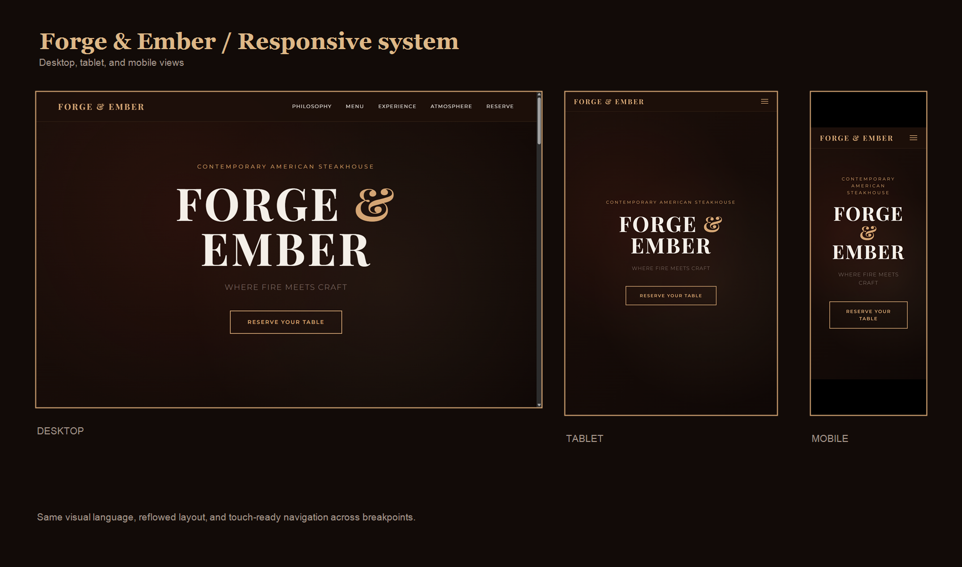
Responsive design optimized for all devices
Deep charcoal backgrounds with ember-orange accents. White text for high contrast. The palette evokes wood smoke and glowing coals.
Heavy, condensed display type for headings. Confident, assertive hierarchy. Every headline demands attention without shouting.
Full-bleed hero images of fire, cuts of meat, and restaurant interiors. Dark, moody lighting. Every photo tells the story of craft and quality.
Subtle textures, refined animations, careful spacing. The dark aesthetic never feels heavy—it feels premium, exclusive, intentional.
A bold restaurant direction works best when it is built around one clear idea. Here, fire becomes the thread connecting the brand, menu, photography, and the feeling of a visit.
Let's discuss how a clear point of view could set your restaurant apart.